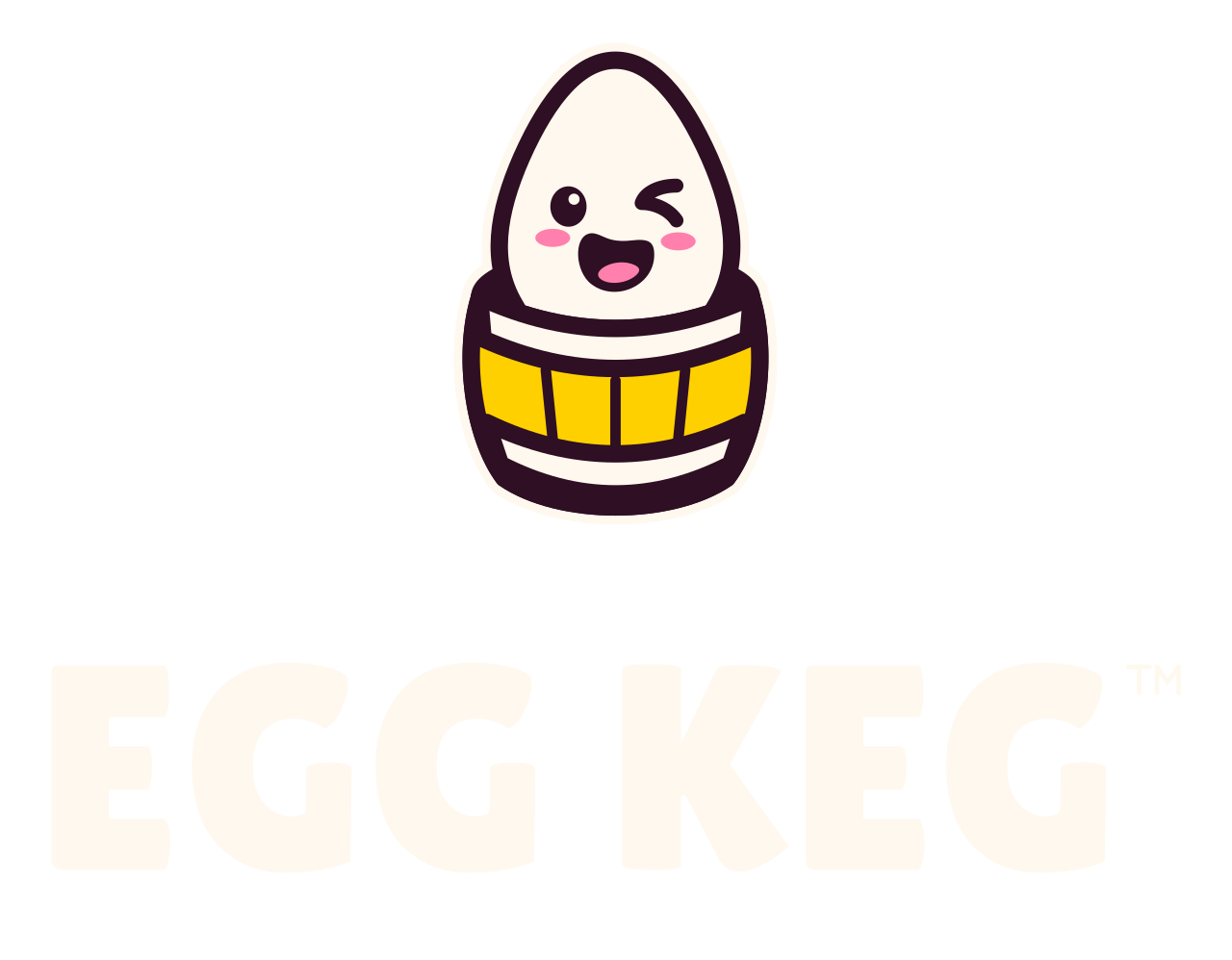
Digital master
Studio mark · Full color
Studio signature, large avatars, labels and editorial illustrations.
48px high for the full face; use the simpler mark below that.
The Egg Keg field guide
Our marks, colors, type, and playful details, all in one place. The same ingredients that make the studio feel like Egg Keg.
Digital reference · 22 variations · 136 files

01 / The signature
The full mascot carries the studio name. Compact marks keep that same wink and smile when space gets tight.

Primary lockup for website headers, banners and wide placements.
220px wide is a starting reference; inspect at the final display size.
The egg-only favicon is active: a complete shell, compact wink, and rounded smile in plum and cream. Check these raster exports at their real sizes.
 16px
 32px
 48px
 16px
 32px
 48px
02 / Our ingredients
Plum, cream, and yolk anchor the identity. Pink adds warmth; purple carries splash energy. Game artwork keeps its own colors.
Day mode · Following your device setting.
Use semantic tokens for text, surfaces, and borders. The page and the main studio share these values, so switching themes keeps them together.
Download color & type tokens ↓| Role | Day | Night |
|---|---|---|
--text | #2E0F23 | #FFF8EE |
--text-muted | #714159 | #DFBED0 |
--surface | #FFFCF7 | #352039 |
--surface-soft | #FFE3ED | #4C2A43 |
--accent-text | #7A1B75 | #EDB1F3 |
--splash-ink | #9C27B0 | #B63BC8 |
--matrix-rest | #FFFFFF | #FFFFFF |
--matrix-ink | #9C27B0 | #B63BC8 |
--line | #D9B7C5 | #77536D |
03 / The way we move
Big, rounded headlines meet readable body copy. Motion responds to a moment, settles quickly, and gives the artwork room.
Lilita One · display
Ready, set,
crack!
M PLUS Rounded 1c · body
We make Roblox games for players who see a ramp and ask, “Think I can jump that?”
760ms shared spring · 6.4s shared breath. CRACK winds up, tips playfully as the egg rises, and rebounds on the same landing beat. The word settles with a smaller counter-rotation; its surrounding type and controls stay still. A compact plum contact shadow sits beneath the keg’s lowest edge, with a soft outer falloff. Its center stays planted and deepens slightly at the egg’s landing. The soft outer edge follows the nearby purple current, sharing its gentle release when stirring and landing overlap. Dots glide along the base with a softer crossing motion and fade beneath the contact; the surrounding current stays continuous. White dots form a broad halo around the logo and an even field behind the headline. The egg’s landing sends a purple ripple from its own center of mass. Hover stirs a flowing wake in the same purple, including behind and directly below the logo. Meeting currents bend together; every dot stays connected to the grid. Purple lingers briefly, then fades back to white as the motion settles. The idle breath resumes afterward. Touch adds a brief ripple. On phones, native scrolling rolls the dots vertically with the swipe and a small springy rebound; momentum blends into existing ripples, then settles back to white. The keg and text keep their footing. Reduced motion, data saving, and offscreen content keep the field quiet.
04 / Take what you need
SVG is the lightest starting point for these marks. PNG and lossless WebP downloads cover small screens, high-density displays, and partner tools.
Download the full kit ↓ Asset manifest ↓22 variations
Digital master
Studio signature, large avatars, labels and editorial illustrations.
48px high for the full face; use the simpler mark below that.

Digital master
Primary lockup for website headers, banners and wide placements.
220px wide is a starting reference; inspect at the final display size.

Design option
Square and vertical compositions, signs, merchandise and title cards.
160px wide is a starting reference; approve optical balance in context.

Digital master
Compact navigation, inverse footers, partner credits and supporting signatures.
110px wide with the trademark. Avoid shrinking the text to fit a badge.
Digital master
Studio signature, large avatars, labels and editorial illustrations.
48px high for the full face; use the simpler mark below that.

Digital master
Primary lockup for website headers, banners and wide placements.
220px wide is a starting reference; inspect at the final display size.

Design option
Square and vertical compositions, signs, merchandise and title cards.
160px wide is a starting reference; approve optical balance in context.

Digital master
Compact navigation, inverse footers, partner credits and supporting signatures.
110px wide with the trademark. Avoid shrinking the text to fit a badge.

Digital master
Studio signature, large avatars, labels and editorial illustrations.
48px high for the full face; use the simpler mark below that.

Digital master
Primary lockup for website headers, banners and wide placements.
220px wide is a starting reference; inspect at the final display size.

Design option
Square and vertical compositions, signs, merchandise and title cards.
160px wide is a starting reference; approve optical balance in context.

Digital master
Compact navigation, inverse footers, partner credits and supporting signatures.
110px wide with the trademark. Avoid shrinking the text to fit a badge.

Digital master
Studio signature, large avatars, labels and editorial illustrations.
48px high for the full face; use the simpler mark below that.

Digital master
Primary lockup for website headers, banners and wide placements.
220px wide is a starting reference; inspect at the final display size.

Design option
Square and vertical compositions, signs, merchandise and title cards.
160px wide is a starting reference; approve optical balance in context.

Digital master
Compact navigation, inverse footers, partner credits and supporting signatures.
110px wide with the trademark. Avoid shrinking the text to fit a badge.

Proof needed
Small physical applications and low-detail digital marks where the complete keg should remain visible.
Start at 32px high digitally. Physical minimum depends on material and process.

Proof needed
Small physical applications and low-detail digital marks where the complete keg should remain visible.
Start at 32px high digitally. Physical minimum depends on material and process.

Proof needed
Small physical applications and low-detail digital marks where the complete keg should remain visible.
Start at 32px high digitally. Physical minimum depends on material and process.

Design option
Social profiles, home-screen icons and square placements that may receive a circular or squircle mask.
96px master derivative. Keep essential content inside the central 80%-diameter circle.

Previous version
Previous browser icon, retained as a reference.
16px; inspect the native-size PNG rather than only the enlarged SVG.

Active favicon
Active browser tab and bookmark icon.
16px; check the native-size PNG for the smallest browser tabs.
05 / Keep the character
Keep the face expressive and the artwork clear. These examples are the shared reference for the next round of polish.
Start with clear space equal to one quarter of the mascot width. Scale uniformly, and use the supplied layouts instead of squeezing the wordmark into a gap.
Use the full face for larger displays, the simplified mark for tight spaces, and the favicon at tab size. Keep the avatar’s important features within its circular safe area.
Use reversed artwork on dark surfaces. One-color versions preserve the face through cutouts. Keep gradients and splashes outside the core logo.
Embroidery, stamps, engraving, and small print need a sample at the actual production size. A digital preview is not a production proof.
Both pages load the same generated tokens, components, theme controller, and motion styles. The brand marks are built from the same mascot geometry. Theme choices synchronize across tabs; device preference remains available.
srcset and sizes rather than sending the largest file to every device.Generated files: asset manifest · shared token source. Historical artwork remains outside this kit.